A2 Media Production: G324
Digipaks
Digipak's are not commonly used as a case for CDs because they are card which is not as sturdy or durable and therefore the CD(s) inside are not protected as effectively. Due to this I only have two digipaks, shown below.
I like the layout of this digipak as there are many different templates that can be used such as catering for one CD or 2 as well as different folding patterns. I like this 3 fold template that You Me At Six have used for their album - Cavalier Youth as it ensures that the photographs must be seen in order to get the CD out, rather than ignoring them. I think that I will also use this style template when I create my digipak.


I like how the band name is spread across all 3 parts of the digipak and written in white. White connotes rebirth, suggesting that this album is a new version of their music and something lively and exciting to listen to
I like how the same image spreads across the front and back cover but the image in the middle of the digipak, when opened - is linked to the other image (both shot in the sunset with a young boys' silhuette). I will ensure that I use this technique as it ensures that there isn't an image which appears to be the odd one out when fully opened

I like how the images on the front and back are related and are the same image with the only difference being the bench missing. However, I do not think the meaning is clear, I will try to include an image which has a clear image but is still eyecatching like this one.


I like how the title of the album is repeated when the audience open the digipak. It is a simple typography and all the attention of the audience is focussed on it.

Mumford & Sons' digipak uses the same colours throughout - black and white with a hint of blue which I think could be an overlay. The initial look of the digipak does not include any images of the band until it is opened and the digipak 'comes to life' - showing the band in a recording studio. This allows the audience to see the band and connect with them; I will be including an image of the artist in my digipak creation because I think that if the artist and the audience can connect then the audience will buy more of the products.
I have noticed that alternative bands usually use digipaks when producing and distributing their music. I think this is because they are not being sold to such a large audience like pop music artists' music would be. The creation of CD cases would be a lot quicker to create for a large audience. It is important that the digipak has significance, meaning and is relevent to the artist/band.


A convention for album front covers is to include a picture of the artist. The artist is the main focus with no props or a background that will distract the audiences' attention from them, this is also done by centre framing the artist and usually using a medium shot. I will consider putting an image of the artist on the front of my digipak creation, if not then I will take an image in a location where the music video is shot, possibly including one of the characters from the video.
The name of the artist is in a bigger size than the name of the album, I will definitely stick to this convention as the artist is what is selling the album rather than the songs that they would not know without purchasing the album. It is all written in a symplistic typography so that it is easy for anyone to read, I will also make sure that I do this with my digipak so that it is not misread and is more eyecatching and appealing to everyone.
Templates
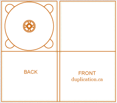
This is a very basic template that follows the style of the regular plastic CD case which simply opens and closes like a book.
This would be quicker to create as it needs less images to be taken as there is less space to fill, however I think it is too basic and I would like to create a digipak of a more interesting style than this.
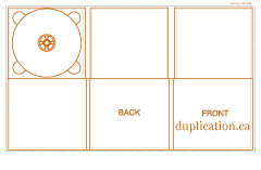
This digipak template is more intersting than the last as it involves three pannels and more openings. This is the same style as You Me At Six used for their album. I like this style a lot becuase it shows lots of different pictures so the audience can connect more with the artist.
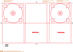
This template is for 2 CDs, however I think I will use a template made for only 1 CD. However, this is a style that I like as it ahs more openings and the ability to show more of the artist to the audience. I could still use this template but include a cover art booklet inside the space made for a CD instead.
Song List
I have noticed that a convention for the back of a digipak or CD case is for all of the songs by the particular artist within that album are mentioned. This is something that I will include because it is helpful for the audience to know which song number to go to when they are listening to it as well as being able to see if they want to buy it by quickly looking down the song list to see if they like any of the songs. Being on the back does not take the attention away from the artist, however it is easy to see on the digipak.
My group and I have decided on our song that we are creating a music video to - James Bay - Let It Go so I am able to look at the other songs which were released on the same album as this.
-
Craving
-
Hold Back The River
-
Let It Go
-
If You Ever Want To Be In Love
-
Best Fake Smile
-
When We Were On Fire
-
Move Together
-
Scars
-
Collide
-
Get Out While You Can
-
Need The Sun To Break
-
Incomplete
-
Running
-
Clocks Go Forward
-
Stealing Cars
Lyric Booklet
A lyric booklet is a commonly used aspect of a digipak or CD case. It allows the audience to learn the songs and understand the meaning behind the lyrics which tell a story.
I will be creating a lyric booklet becuase it is conventional and professional.


The first style of booklet is shown on the left. It has an image on one page and the lyrics to multiple songs on the other page. It is a simple design which focusses the audience's attention on the lurics rather than the image.
The second style of lyric booklet is to have the image covering both pages and the lyrics also on both pages. This sample to the left shows the image drawing attention towards itself